Monday, January 24, 2011

Movie Trailer Reflection


1. How did you decide what type/genre of movie to make? Explain.
My partner and I decided what type of genre of movie to make by listing all the genres that are possible to do. Then, one by one, we looked at each genre specifically and asked ourselves if we had the materials needed to make a trailer. So for example, we looked at the fantasy genre, thought of a quick plot and realized it might be too complicated to make since we didn't know how to do the special effects and we didn't have costumes. We chose horror because it was an easy genre, no extreme effects required, and shooting can be accomplished in school. 

2. Describe what part of the movie trailer project you enjoyed the most. Why?
The part of the movie trailer I enjoyed the most would be filming the scenes. I enjoyed the production part of the project because before during pre-production, my partner and I were putting our ideas on paper, drawing them on storyboards. When we started filming, it was exciting seeing all the drawings we did on paper be executed by live actors. It was a fun, hands-on experience that let us express our creativity.


3. How has your learning expanded in terms of creating media products over the course of the semester?
Over the course of the semester, my learning has expanded in terms of creating media products. I am more educated in the advertising strategies for campaigns and the different ways to attract different types of audiences. For example, it would take a different method to attract a younger teenage audience than it would to attract an older audience of senior citizens. I also learned of the different ways to convey messages in advertisements. I also am more knowledgeable about the different types of camera moves for commercials and movie trailers to make them more appealing and how the elements of designs are part of create a successful advertisement. I also know that there are many medias such as sound, image, and words. I also now know that there are many mediums such as print, media, and sound.

4. Of all the media "texts" that you have created this year, which ones would you want to share outside of class? 
Of all the media "texts" that I have created this year, I would share my culminating project, the movie trailer campaign outside of class. My partner and I spent a lot of time forming a plot for the trailer and filming enough footage for the trailer. Editing all the video we shot into one short movie trailer, adding audio, and syncing voice overs and music was difficult but the finished product was good. The movie trailer was one of the biggest things I did this semester and I think it was one of the best things I did. I want to share that success with others outside of my class.

Tuesday, November 30, 2010

Analyzing Ads


1. What type of Media is it? (TV, Print, Direct Mail, Online, Outdoor)
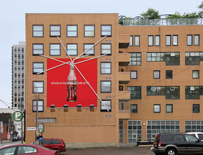
 This ad is an outdoor media piece.

2. How does it try to persuade the buyer?
This ad tries to persuade the buyer by using the bandwagon and a bit of the excitement advertising strategy. It tells viewers that everyone is drinking Coca Cola now a days and that drinking Coca Cola will help you relax in life and feel cool. It tells how having fun is the "Coca Cola side of life", not stressing about everyday problems. They used bright, crisp colours in their ad.

3. Does it employ emotional appeals or is it more rational, fact-based?
I think this appeals to us emotionally more than just rational or fact-based. The advertisement makes you think that you have to drink Coca-cola in order to be like everyone else. This ad shows that everyone like Coca-cola and that if you don't drink it, you're not accepted by others. Just by looking at the advertisement, it makes me feel really thirsty. I feel like I need to go to the nearest store and buy myself an ice-cold Coca Cola.

4. Who is the ad targeting and how can you tell?
The ad is targeting mostly teenagers and young adults. I think that children would not be able to understand an advertisement like this with the ad message and the straws so this is definetly focused towards the older teens who don't usually drink Coca-cola. The clever ad tries to get people who don't drink Coca Cola to try it.


1. What type of Media is it? (TV, Print, Direct Mail, Online, Outdoor)
This is a TV piece of media.

2. How does it try to persuade the buyer?
The TV commercial tries to persuade the buyers by using the excitement and the heart strings strategy. It shows the IKEA store and what it might be like when the customers are not around. It shows the store as a mysterious and quiet place that customers never would be able to see in the day time. It also shows the cats coming out to play and having fun. You want to find out what they're doing in the store or where they're going. The commercial tells also a warming story of cats wandering around in the store, playing around, and then finally finding a comfy place to sleep. It's a scene that brings peace to your mind when you see the cats sleeping in a bed and making them feel like they're at home.

3. Does it employ emotional appeals or is it more rational, fact-based?
Yes, this employs emotional appeals rather than rational, facts. It shows the need for change, happiness, and luxury. At the end of the ad, it puts a smile to your face and makes you feel relaxed. When the cats start to play with each other after wandering around the store, they start feeling tired. Each cat almost represents a single person and their personality. The cats find their own comfortable spot like a bed, couch, or a table and finally drift to sleep. It makes you feel peaceful watching the cats relax and makes you want to go and buy the comfortable furniture.

4. Who is the ad targeting and how can you tell?
The ad is targeting mostly adults and even cat lovers. People who are fond of dogs would probably not enjoy watch cats lurk around stores. People who like cats would probably be more attracted to this commercial and would want to buy what the commercial is selling. The furniture seen in the advertisement is mostly for adults who want to move out and buy furniture for their house. Teenagers and children would probably not want to buy furniture. It's a 'sophisticated' ad for an older audience.

IKEA ADVERTISEMENT 
  • How does the ad design convey the advertisers’ message? Why do you think particular aesthetic elements (typefaces, photographs, camera angles etc.) were chosen? How do they help establish an overall mood for the ad?
The ad design conveys the advertiser's message by using cats to represent people and their different personalities. Some are energetic, some are lazy, some noisy, and so forth. I think the simple sans serif typeface is used is to keep with the simplicity of the commercial itself. They didn't use any special effects, just a lot of cat actors and lighting. The camera angles such as pans, closeups, and wide shots were used as well. They are easy to achieve an effective look to the ad. I think these aesthetic elements were chosen because they give a kind of modern look to the ad. IKEA is a big company selling quality furniture, I think they wanted to make the ad more sophisticated make it look more luxurious. These help establish an overall mood to the ad by making it look more mysterious. The elements combine well together to make it seem like the store itself is full of secrets that are hidden. The lighting also makes the ad feel like a kind of dream where everything is all hazy and relaxing.
  •  Ads tend to communicate more through images (and in the case of television, through movement and music) than words. How are images, camera angles and movements, music and other visual elements used to convey messages in the ad?
The music in the ad is soft and peaceful. It has a nice piano piece with soothing vocals at the end. The music is not hectic but calm. The lighting for the ad is soft, it's not too bright yet not too dark. They don't use a lot of key lighting but they use a lot of fill light. There is a lot of contrast in some scenes of the cat and the background. For the camera angles, they used a lot of panning and follow shots. There are some medium, wide, and closeups of the cats. The ad does some trucking shots. They also incorporate blurring the background or parts of the foreground to focus on the cats a bit more. These all are needed to convey the message in the advertisement because it makes the ad stand out from all the other store ads. It's different and creative yet simple. It coveys the message how everyone has a unique style and taste. Some prefer one thing while others something else. All those elements make it this ad different just like a single person in the world with different ideals.
  •  In the imagery, what appears in the foreground versus the background? Why do you think these choices were made?
For the imagery, most of the times, the cats are in the background with the furniture. Sometimes the cats appear in the foreground while IKEA furniture appear in the background.  I think these choices were made because the commercial is advertising its furniture not the cats that are lurking around it. 
  •  Precisely what is the product being offered for sale? What do you learn about its objective qualities? (Try to distinguish here between factual versus emotional appeals.)
The products being offered for sale are IKEA products, especially the chairs, beds, tables, and lights. I learned that the products being offered for sale are used for emotional appeals not factual. The furniture looks soft and colourful. Along with the dark lighting, it really brings out the vivid colours. The furniture looks like it comes in many shapes and styles such as the lamps and the beds. The products make me feel happy inside and it makes me want to go to IKEA and buy some of the products.
  •  Look carefully at the locale of the scene. Where does it take place? What significance is the locale likely to have for the intended audience?
The commercial takes place at a IKEA store in the United Kingdom at night when the store is closed. The significance for the locale is likely more focused on attracting the adult audience. Having the store filmed at night relates to how adults, after going to work and doing their jobs in the day, they can do anything they want. The night is a time of possibilities and fun. This also might be for older teenagers as well. The store is empty at the beginning but slowly, cats come out and they start to scatter all over the place.

Thursday, November 18, 2010

A Little History…

1981–1991: Music videos go mainstream

1. What was the first music video featured on MTV?
The first music video featured on MTV was called "Video Killed the Radio Star" by the British group called the Buggles.

2. What were the two key innovations in the development of music videos at this time?
The first key innovation in the development of music videos at this time is the advancement of inexpensive and easy-to-use video recording and editing equipment. The second key innovation is the development of visual effects which are achieve  by methods such as video compositing. High color quality video tape recorders and portable video cameras were introduced in the New Wave era that made creating promotional pop videos quick and cheap.

3. When did the video for Michael Jackson’s “Thriller” debut? What was important about this video?
The video for Michael Jackson's "Thriller" debuted on December 2, 1983. The video was the most successful and influential music video at that time. Thriller set a new standard for music video production, having cost about $500,000 U.S. to film.


1992–2004: Rise of the directors

1. What new feature did MTV implement?

MTV began to list the directors along in the artist and song credits starting in December of 1992. This shows that music videos have been more of a film makers' base for their ongoing career. Some directors such as Michel Gondry and Spike Jonze started their directing career around this time. 


2. What was changing about the music videos?

Music videos were becoming more expensive as the years went by. Two of the most expensive ones were directed by Mark Romanek who directed Michael Jackson's "Scream" and Madonna's "Bedtime Story." Scream cost $7 million while Bedtime Story cost $5 million. Also during this time, music videos were being shown around the world on international channels, all launched by MTV. In 1996, M2 was launched to show more older music videos.


2 Other Interesting Facts

  • In 1991, Michael Jackson's "Black or White" music video dance segment was cut because the video showed him wrongly touching his body.

  • From 1999-2001, a  peer-to-peer file sharing service called Napster was launched. Users were able to share video files, such as music videos, with each other.

Pop Music and Music Videos

A type of music that interests me is country.


1. What is the dominant message of these videos?
The dominant message in Two is Better than One is that a person's future is important but it's meaningless without anyone to share it with. When you meet someone special and they disappear from your life, everyday feels empty and bare. Having someone to share your life with is better than being alone.

The dominant message in There Goes My Life is that people have to let go of their dreams in order find true happiness in their lives. As a person grows up and begins to raise a family, they have to put away their life's desires and move ahead. As time goes on, people start to find new hopes and dreams and feel truly blessed. When the ones closest to you goes away, it feels like your 'life' itself, the one you always cherished, is leaving.

2. What are the similarities between these videos?
The similarities between between these two videos is that they deal with growing up and being in a relationship with someone. Both videos talk about romance and how being with the person you care about is important. If they did not meet, their lives and futures would be completely different. The videos also show that they are grateful to have met each other.

3. What are the differences?
The differences in the two videos is that Two is Better Than One focuses more young teenage love and how without the person you love, life feels lonely and empty. There Goes My Life focuses more on growing up from a teenager into a parent with a family. The video talks about how as people start to grow up, they begin to find new importance in their life and how it's hard letting it go. It shows the importance of being a good parent and making the right decisions.

4. How are the following individuals depicted in the videos? 
Two is Better Than One:
  • Teenagers: In the video, the teenagers are the ones falling in love. They are the ones driving cars and living by themselves in their own house.
  • Women: The woman in this video does all the chores around the house and being the passenger on a car drive. The man sings about how he feels lonely without her.
  • Men: The male is the one singing about how his life would not be complete without the woman he loves. The video shows men are the ones who play in bands and drive cars.
There Goes My Life:
  • Teenagers: Teenagers in the video are the ones that  go off to college/university. They are the ones who decide their futures. Teenagers go to high school to attend classes and they are the ones that fall in love.
  • Women: Females are the ones getting pregnant and caring for the family. Females are wives that stay home instead of working to look after the children and family.
  • Men: Men depicted in this video are the ones who join sports team like football. They are the ones working at their jobs while the wife is at home. Men are the caring fathers in the family in the video.
  • Parents: Parents are the ones in the video that care most about the future of their children. They are the ones who look after their children when they grow up and the ones who see them off as they head onto college or university.
5. What lifestyle choices are promoted in these videos?
In Two is Better Than One, lifestyle choices promoted in these videos is that young couples should drive in new model cars and live in rural parts of towns. In There Goes My Life, the lifestyle choice promoted in this video is that teenagers should drive nice cars, teenagers should go to college/university, men should join the football team, and people should start thinking about developing a family earlier in life. Another lifestyle choice in There Goes My Life is the man sings about the girl wearing Abercrombie clothes and using Mastercards.

6. What trends in popular culture have been inspired by these videos?
Trends in popular culture that has been inspired by these videos is that Country has become more modern over the years. In the videos, especially in Two is Better Than One, people singing country music don't always now a days wear cowboy hats and cowboy boots. In There Goes My Life, the singer, Kenny Chesney wears a cowboy hat but his shirt and pants are more current with the fashion today. These videos are promoting more modern cowboys and attracting a wider audience.

7. How has this music influenced your life?
This type of music has influenced my life in a positive way. Country music makes me want to appreciate and think about what life has already offered me. It makes me want to look towards the better side of life and be thankful for who I am  and my parents who raised me. Country music has made me think more not about the past but about the future that awaits. The songs have a very deep meaning in them and almost everyone can relate to the words being sang.

Thursday, November 11, 2010

Change of Tone


1. What is the original tone/mood of the video?
The original tone/mood of the video was suspenseful and intense. The movie, The Dark Knight, is an action movie about Gotham's superhero, Batman, as he faces off against the villain Joker. The video had a more serious tone where Batman was running away since he's being chased by the police. The music for the video was fast-paced with a lot of drums, trumpets, and a bit of violin in the background. The tone gave Batman a mysterious aura and made me want to find out what would happen to him after he ran away. It makes me feel like Batman is not an average kind of superhero who is always showered in praise but is always willing to help.

2.  What song/sound did you choose to the tone/mood of the video?
The song I chose for the tone/mood of the video is a more melancholic piece opposite of the fast-paced intense music. It is a slow violin piece played by Thao Nguyen called "Sad Romance."

3. How did it change the tone/mood of the video? Why did it have that effect?
The music changed the tone/mood of the video and it became more sad and forlorn. It is now a more depressing mood than it was from the intense mood before. It had that effect because the violin piece I added to the video was very slow and melancholy. Instead of an action genre, the music made the movie kind of like a romantic tragedy. With the violin music in the background, when Batman was running away, it gave it a very sad kind of tone like he was disappearing into the darkness forever. The violin piece was sad so thus making the video clip very depressing.

Friday, October 22, 2010

Keeping Score - Summary

SUMMARY:
Video games have changed over the years since it was first invented. An essential part of video games is the music, which provides a mood and atmosphere. Paul Levasseur, a student at University of Toronto is studying musical composition and wants to become a game composer. There are many audio programs for film sound and music but they far exceed in number than programs for game audio. Sometimes, game producers that attend audio-film programs do not get enough experience to prepare them when composing audio for games. The video game industries are setting high expectations every year yet audio composers who come on to the job are way below expectations. People such as Karen Collins want to see more video game audio programs in universities and colleges. Video games is a growing industry and they need suitable programs to prepare composers for the job.

Thursday, October 21, 2010

Culture Jamming Project

Media Piece 
Here is my the final outcome for my own culture jam advertisement. (click for full view)


REFLECTION QUESTIONS:
1. What aspect of your culture jam do you find most successful and why?
The aspect of my culture jam that I find most successful was the image of the culture jam itself of the Burger King as the Statue of Liberty. I spent a lot of time manipulating the King into the image and it turned out very well done. I tried to make it look like the statue was of the King originally.

2. What aspect of your culture jam do you find least successful and why?
 The aspect of my culture jam that I find the least successful is my message. My message wasn't very strong and clear. I wanted to convey that fast food is negatively affecting our lives but they are increasing in countries. I also wanted to say that corporate logos and fast food mascots (such as Ronald McDonald) are everywhere in society today that even children will be able to recognize them. It is hard to understand the message by just looking at the piece and that is why this is the least successful thing in my project.

3. If you could do this project again, what changes would you make to improve it?
If I could do this project again, changes I would make to improve it is by choosing a clearer image to represent my message. I did not put much thought into creating my message so when it was time to work on my culture jam advertisement, the two didn't go very well together. I would have chosen an image of something more easier to photo manipulate as well since the advertisement itself was very time consuming. My culture jam doesn't convey such a clear message. If I used images related to McDonald's then my culture jam would have been clearer and a lot more powerful.

Tuesday, October 12, 2010

Culture Jamming Project

 Pre-Project Analysis
1. This advertisement subverts the company McDonalds.

2. The McDonald's Big Mac is being advertised / subverted in this production.

3. Imagery such as heart monitor and surgeons in the middle of operating on a patient are used in the advertisement to subvert. The surgeons are frantically working on the patient. The waves on the monitor form the shape of the McDonald's 'M' which is known by almost everyone making it very effective.

4. The message "Big Mac Attack!" is used in the advertisement to subvert. They combined a life threatening situation of a heart attack and the McDonald's Big Mac sandwich into one line.

5. Some elements and principles of design used to convey a message in this piece are line, colour/hue, and contrast. Line, visible in the heart monitor that tracks the beat of the heart forms a curve of the McDonald's "M". Also, the chart in the background hanging underneath the patient saves that the person is gradually dying. Colour/hue is visible in this piece. The whole image is kind of saturated in blue which kind of makes the image very cold and eerie. Also, the contrast in this from the heart monitor's black background to the bright pink lines makes the "M" stand out a lot from the rest of the image.

6. The target audience for this advertisement is probably for teenagers and young adult, especially those who eat fast-food a lot.

7. This ad jam does convey a clear and successful message. It shows that eating from fast food restaurants such as McDonalds can be bad for your health and can lead to death.

8. This ad jam could be improved in some ways. The text for 'Big Mac Attack' looks like it's been placed there without much thought. The text could be a bit bigger for it took me a while to notice it. I think in the background with the patient that the surgeons should be more urgent and hectic. Overall, there is nothing much that can be improved on.

Monday, October 4, 2010

Public Space – Street Art

1. Definition of STREET ART:
An amorphous beast encompassing art which is found in or inspired by the urban environment. With anti-capitalist and rebellious undertones, it is a democratic form of popular public art probably best understood by seeing it in location. It is not limited to the gallery nor easily collected or possessed by those who may turn art into a trophy. Considered by some a nuisance, for others street art is a tool for communicating views of dissent, asking difficult questions and expressing political concerns. [External Website]
2. The news article I will be using is:


 SUMMARY:
The article talks about the rise of street artists and the widespread of their art work on street walls and other public surfaces. People, especially officials, are unsure if the graffiti on the walls today can be called vandalism or art. Many famous street artists, such as Banksy, have their works sold at very high prices or exhibited at art shows. Each person feels differently about the art they see in the streets. Some feel that they want to stop street art. They believe jailing them is not the solution. Others enjoy the expressive opinions and want street art to stay. The article also talks about how street art will be viewed as vandalism or not if the owner of the property deems it to be. The media organization of this is a British newspaper called 'the Independent'.

3. PHOTO 1:
  
  •   The location of this street art is on a road in Geldern, Germany between a couple of residential buildings.
  •  The street art contains many jagged lines from the rocks. It's a whole image of water and molten lava. There are a lot of reds and blacks from the lava and the rocks and shades of white and blue for the rushing water underneath.
  • This street art grabbed my attention because this piece looked very realistic. The details on this one makes it look like it's actually happening right in front of your eyes.
  • The street art is making me think that the end of the world, or apocalypse, is coming soon and it's going to be devastating.
PHOTO 2:

  • This street art is located in Bethnal Green in London where the piece extends from the road, onto the sidewalk, then to a wall of a building.
  • Images such as the flower and the man sitting with a paint roller can be seen in this piece. Shapes such as circles and flowing lines can be seen in this artwork. Colours such as white, and black for the man and yellow for the flower are visible in this piece.
  • This street art appealed to me because it looks very simple and the way the piece starts out from the lines in the road and then flows to the wall is very impressive. The large flower grabbed my attention first and then I suddenly noticed the man sitting next to it. It also appeals to me because there is such a large contrast in size between the man and the flower.
  • A comment this street art is making me think is that beauty can bloom almost anywhere even in the most unlikeliest places.
In Banksy's "Shop" section of his website, he encourages you to take anything from his site and make it your own but for non-commercial purposes. I think he does this because he creates his art out in the streets for people to appreciate or look at. He makes his art work an expression of mind and a way for his thoughts to be heard. He wants others to enjoy his art but not make money off of it.

      Tuesday, September 21, 2010

      Surveillance: In-Class Assignment

      1. Three websites that address the topic of "surveillence" are:
      2. I will be using this site:
      CONTENT: The site gives you a definition of what surveillance is, where the origin of the word is derived from, and where surveillance can be used in society today. The site also give examples of surveillance and mentions a bit about medical surveillance. They list telephones, computers, cameras, and social networking sites as types of surveillance.
      PURPOSE: The purpose of the website is to inform the reader and raise awareness about surveillance and how it is different in society today than it was before.
       3. FORM: The website contains conventions such as text and hyperlinks to related blog posts. Some design techniques such as colour, layout, font, and the header/footer are visible on the website. The site uses reds, whites, and blacks for their layout. The font is dark and big enough that it can be easily read without problem. They positioned the content of the article in the centre of the layout. The header is very simple, containing a search bar and navigation tabs. Their site's name, 'Articles Factory' is big and stands out very well on the white header. The bottom footer contains a more in-depth navigation of the articles that can be found on the site. The site overall is very simple and professional.

      4. AUDIENCE: I think this website's audience is for teenagers or adults. The site looks really professional so it's probably intended for older readers. There are no images on this website either. I do not think kids would be drawn to a website with a very pale colour scheme. There is nothing bright to attract a child's attention on the website so it's defintely for an older audience.

      Sunday, September 19, 2010

      Image, Text, Audio, or Video: Analyzing Media

      I will be analyzing my chosen video media.


      Media Text
      What is this?
      It is an advertisement for a Porsche.

      Can you name three things like it?
      Three things like this commercial is a Honda commercial, a GT3 RS Porsche commercial advertising their new car, and a Toyota commercial. All three I saw on television.

      What colours are on it?
      Many colours are visible in the advertisement. The colour of the boy's clothing, red, makes him stand out from the crowd. The colour of the car is silver.The whole video has a 'grey' kind of atmosphere. It's not saturated with colour but has more of a cooler hue to it. There are a lot of greys, blacks, and greens in the commercial.

      What values are promoted?
      Promoted values such as speed, freedom, independence, and pleasure are visible in this advertisement.

      Does it contain stereotypes?
      Yes it does contain stereotypes. It shows that all men and boys like shiny cars and want to have one.

      What values are omitted?
      Omitted values such as prosperity/wealth and responsibility are not present in this advertisement.

       Audience
      Why do you like it?
      I like it because it targets not only the older teen and adult audience but also targets the younger audience as well.

      Why do your parents like it? Your friends?
      My parents like it because it is professionally well done. My friends like it because the execution of the commercial is different from the ones seen on television.

      Could this thing scare somebody? Why?
      This could scare definitely scare somebody. I think it would scare parents of younger children watching this. They might think that their children will be attracted to cars at a young age like the one in the commercial.

      Why would you buy this?
      N/A. I can't buy the commercial. I can buy the Porsche though. It's well presented in the advertisement. They made it look sleek and appealing to the viewers.

      Who else would want it?
      N/A. Adults would also want the Porsche though.

      Why do you want to collect it?
      N/A. I can't collect Porsches or the commercials.


       Production
      Who makes it?
      I don't know who made the commercial but it was probably a editing company hired by Porsche.

      How much money do you think it costs?
      I think it costs over $6000 to make the advertisement.  There's a lot of planning before shooting the commercial, then filming and hiring actors for the job, then post-production to add the finishing touches and effects. All that to make a small commercial is worth a lot of money.

      Where was it made?
      I do not know where this was made exactly. I think it was filmed in a small neighbourhood near a school in the United States of America.

      Where are some places you can buy it?
      N/A. You can't buy the commercial, but you can buy the car marketed in the advertisement.

      Can you tell me where it was made (produced)?
      The advertisement was made somewhere in the United States of America by a commercial company hired by Porsche. 

      Have you seen a commercial for it on TV, in a book, or a newspaper, website, or game?
      I have seen an advertisement of this Porsche in a magazine once.

      Who owns the copyright for this text?
      Porsche North America owns the copyright for this text.

      Friday, September 17, 2010

      Image, Text, Audio, or Video

      The three pieces of media I chose in response to Mr. Cram's Image, Text, Audio, or Video.


      Audio

      Image

      Video